Thursday, 12 March 2015

What I have Learnt from Audience Feedback

A focus group is the most grass-roots way you can learn about the media business. By gathering a select group of regular people together, you can find out how your company is perceived versus your competition. The answers you get can be a road map as you build your brand.

The advantages of using a focus group is that:
  • The researcher can interact with the participants, pose follow-up questions or ask questions that probe more deeply, this means that as researchers we can gain a deeper meaning behind what people say.
  • Another advantage is that Results can be easier to understand than complicated statistical data, in numerical form, as this is complicated to work with and is hard to put into practise.
  • The researcher can also get information from non-verbal responses, such as facial expressions or body language, which adds a deeper understanding to what the participants are saying.
  • The Information is also provided more quickly than if people were interviewed separately.­


However the downsides of using a focus group include:
  • The small sample size means the groups might not be a good representation of the larger population.
  • Group discussions can be difficult to steer and control, so time can be lost to irrelevant topics.
  • Respondents can feel peer pressure to give similar answers to the moderator's questions.


Qualitative research gathers information that is not in numerical form. For example, open ended questionnaires, unstructured interviews and observations. 
Qualitative data is typically descriptive data and as such is harder to analyse than quantitative data.
Qualitative research is useful to studies at the individual level, and to find out, in depth, the ways in which people think or feel.
Analysis of qualitative data is difficult and requires accurate description of participant responses, for example, sorting responses to open questions and interviews into broad themes.

Quantitative research gathers data in numerical form, which can be put into categories or in rank order, or measured in units of measurement. This type of data can be used to construct graphs and tables of raw data.


Monday, 9 March 2015

How effective is my promotional campaign?


In order to assess the effectiveness of our promotional campaign, we decided to create a mock interview. We wanted to create a mock interview like an online talk show, hence we filmed it against the green screen to give it a studio feel, and make it feel like a vlogger. We employed a member of the drama department to act as our interviewer and gave him questions to pose to us, to make it feel authentic. Overall I feel we were successful in creating that mock interview process, and it feels like an authentic like chat show on my vlog.

Powered by emaze

Saturday, 7 March 2015

In what ways does your media product, use, develop or challenge forms and conventions of real media products?

The generic conventions of a music video are defined by Keith Negus

He suggests that the music video is the explicit promotion of the artist's "image" as a specific product with a brand identity, ready for consumption on a mass scale.
The artists "image" could be based on their aesthetic body image, their generic pop image or their ideological image.

In all music videos, without exception will feature the artist either based as the singer or acting to add to the overall cinematic experience.
Keith also highlights that there should be a wide and extensive use of shot types, camera angles and movements, without this the viewer will be easily bored.
Repetition of recurring thematic elements and generically specific iconography, which is one key element often being dominant and providing the skeletal structure for the promotional video, should also be present in the music video.
Negus also advises that a possible narrative structure can work in a promotional music video, in addition a possible performance element will show to the audience that the artist isn't just a generic synthetic artist.

The director is allowed to have flexibility to disregard realism, this will mean that the director is allowed to be as creative as possible since the weirder it is the more it will draw in viewers
Additionally use of special effects including lighting, animation, CGIs and in-camera effects are accepted, since videos are made to have high impact instantly to draw attention.

Shots should cut tightly to the beat of the track during editing, so that the video looks like it fits with the accompanying music track.
This will be accompanied with a carefully constructed Mise en Scene appropriate to the content and tone of the track.


Friday, 6 March 2015

Website - Link

Website Link

If this link does not work copy and paste this link:
leonjacksons.wix.com/haplessromantic

Wednesday, 4 March 2015

Survey Monkey - Audience Feedback


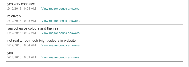
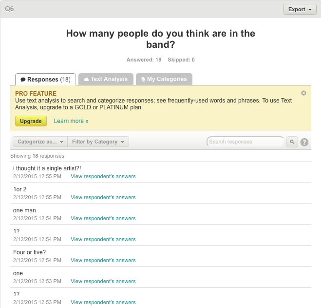
From this Feedback we knew what we did well and what didn't go that well, and in the time we had we were able to tweet a few things in the editing process. And we also attempted to theme parts of the artists star image around their criticism.
Also as the website was in construction at this point I was easily able to change the background since they didn't feel that they fitted with the video to create a cohesive package.

Tuesday, 3 March 2015

Music Video Feedback - Survey

Create your free online surveys with SurveyMonkey , the world's leading questionnaire tool.

Sunday, 1 March 2015

Digipak

Front Cover
Album Tracklist
CD
Credits
-----------------------------------------------------------------------------------------------

Personally I feel, this image is representative of our artist, since the artist itself does not appear on the front of the digipak, just like other artists in the same genre such as Coldplay, Arctic Monkeys, Bastille etc. And rather they opt for an abstract image, than a set up shot of the artist, displaying their organic side.

The symbols of the clouds and the plane wing connotes that the band are travelling, this connects to the album title 'Trouble in Paradise'. The images of the clouds and the plane symbolises paradise and freedom, however since there is a black and white overlay the image, it denotes that something bad might happen, this is a use of foreshadowing.

It also relates to the artist being a 'Hapless Romantic' or unlucky in love and really illustrates the emotional side of the artist, which the audience will buy into.

The use of colour for the bands logo means that it stands out from the rest of the image, it also relates to the music video since it is a single paint smear, and in the music video our lead singer is a 'Painter', ultimately building a cohesive package throughout my product.

The use of Red/Pink invokes passion and romance also relating to the lyrics of the song and the artist's name 'Hapless Romantic.' This will attract the female audience however isn't restricted just to teenage girls since the image used is mature and professional meaning that an older generation or a young teenage boy can easily listen to this as well.

I also created a Deluxe and Vinyl Edition of the album, the only main difference is the colour of the accent, in the Deluxe edition is Gold. and in the Vinyl Edition is Turquoise.


Original Photograph


I made the shot black and white to focus on the form, texture, shape and composition of the image. There is a subtle change in tone and colour, which portrays a whole different colour in reality, and that what makes monochrome images effective.

I then made the image square so that it can be easily made to fit the digipak cover, I did this using the crop tool on Photoshop and using the ratio 1:1 so that it creates a perfect square.

Also on this image it includes the branding of an airline company, using photoshop I edited this out so that the viewer is unaware of the brand.


----------------------------------------------------------------------------

For the Album Tracklist I used a shot of a crumpled up piece of paper as the background for the image, this relates to the music video in which the lead singer crumples up images of the girls he doesn't like.

Also on the tracklist page is the record labels logo, and documentation including copyright and licensing.
Alongside there is also a barcode, all albums must have a barcode to be sold in shops, also the use of a barcode allows for a record label to easily find the number of albums sold by that artist.

----------------------------------------------------------------------------

The CD insert page is an image of a mountain range, again this relates to the emotional side of the artist, and relates to the album cover of the clouds as both are from a high angle.

----------------------------------------------------------------------------

The Credits page is a silhouette of the artist, this was achieved by going around an image of a side profile in photoshop and filling it in with a block colour.

Many other artists have used this technique to conceal the band members identity, some examples include Naughty Boy single covers, and the Dead Leaves album cover: