If you are unable to watch the above video please go to the following link:
Thursday, 23 April 2015
Website Link
Hapless Romantic Website
If this link does not work copy and paste this link:
leonjacksons.wix.com/haplessromantic
If this link does not work copy and paste this link:
leonjacksons.wix.com/haplessromantic
Wednesday, 1 April 2015
Tuesday, 24 March 2015
Transcript - Evaluation 4


We used the internet as a research tool to gain an understanding of similar artists’ im
age, this therefore meant that we could find
what our artist could wear, so they could generically link with the type of music they are playing e.g. Synthetic Pop
 We used the internet as a research tool to gain an understanding of locations, we looked at other artists such as Lily Allen and One Direction who had the set of a Café/Shop, and as a result we researched cafés in the London area, near where we were filming. However due to restraints on timings of the song and narrative, we had to cut out the section in which we filmed on location in the café.
To create our animatic, we first drew out the storyboard, and then once completed, we took photos of each individual shot using our phones, and then sent them onto the Editing workspace using email. After we downloaded the images onto the workspace, we put them into Adobe Premiere Pro. After this we cut each shot to the beat of the music. This enabled us to learn more about the timings of each shot and as a result we understood that we knew we should place in more shots as the cuts through were too long, making the video look dull.

We used a Canon XF305 to film our music video, this was a digital recording camera that enabled us to give a professional edge to our product, and film in High Definition. By using a semi-professional camera we could smoothly zoom in and out, used tracks to create a tracking shot, and make our finished product look as professional as possible.
We researched into similar artists’ digipak, by searching on Google for similar artists and their album covers. As a result we knew what our target audience expects to see from an artist in that genre.
We planned the layout of the digipaks in Coral Draw/Paint, this was a basic software that enabled us to manipulate images into the way we wanted it to be perceived by the audience. By doing this we found out what worked and what didn’t.
I produced my digipak using Photoshop, this professional image editing software allows the user to use layers as a way of control image and manipulating it in a more sophisticated way than Coral Paint/Draw can achieve. As a result of doing this, it meant that the finished digipak looks more professional.
We researched into similar artists websites, by finding their social channels and analysed them for emergent themes. This allowed us to know what to include in our artists websites. Including items such as buttons, sections, and the overall layout etc.
 We planned and produced out website using Wix, this is an online web designing tool in which you can easily create your own website. As a result of using this tool, we were able to be creative and learnt additional new skills.
We made sure our website linked with other technologies such as Facebook, Twitter and YouTube by embedding the artists feed into the websites HTML code, this is so that users can easily navigate to the artists’ social media pages, to spread the message of our artist and to help build target audience and fan base, to ultimately gain more downloads and purchases of the stars music.
Friday, 13 March 2015
YouTube Analytics

From the YouTube Analytics of our product we can identify that the majority of views is female with 74.6% of viewers being female, this backs up our findings that the target audience is women.
We can also establish that the average view duration is 2:14 which isn't the full video length, this will allow the artist to tailor products or music pieces to suit this time frame, since as media producers we don't want consumers to grow bored/disinterested.
Also we can distinguish that the top locations of viewers is in the United Kingdom, however this was only the trial period for this new artist, so we expect the artist to draw more attention over seas, mainly in america, which is the largest market.
This statistical data also allows us to see that the highest portion of views by far is 13-17 year olds, followed by 19-24 year olds, this fits with our target audience of teenage girls.
-------------------------------------------------------------------------
To conclude, we learnt that data can be easily located by large firms to pinpoint the target market and create enjoyable products for everyone.
We can use this information to our advantage by tailoring new products and releases to the audience; including music video, digipak and website.
Thursday, 12 March 2015
What I have Learnt from Audience Feedback

A focus group is the most grass-roots way you can learn about the media business. By gathering a select group of regular people together, you can find out how your company is perceived versus your competition. The answers you get can be a road map as you build your brand.
The advantages of using a focus group is that:
- The researcher can interact with the participants, pose follow-up questions or ask questions that probe more deeply, this means that as researchers we can gain a deeper meaning behind what people say.
- Another advantage is that Results can be easier to understand than complicated statistical data, in numerical form, as this is complicated to work with and is hard to put into practise.
- The researcher can also get information from non-verbal responses, such as facial expressions or body language, which adds a deeper understanding to what the participants are saying.
- The Information is also provided more quickly than if people were interviewed separately.
However the downsides of using a focus group include:
- The small sample size means the groups might not be a good representation of the larger population.
- Group discussions can be difficult to steer and control, so time can be lost to irrelevant topics.
- Respondents can feel peer pressure to give similar answers to the moderator's questions.
Qualitative research gathers information that is not in numerical form. For example, open ended questionnaires, unstructured interviews and observations.
Qualitative data is typically descriptive data and as such is harder to analyse than quantitative data.
Qualitative research is useful to studies at the individual level, and to find out, in depth, the ways in which people think or feel.
Analysis of qualitative data is difficult and requires accurate description of participant responses, for example, sorting responses to open questions and interviews into broad themes.
Quantitative research gathers data in numerical form, which can be put into categories or in rank order, or measured in units of measurement. This type of data can be used to construct graphs and tables of raw data.
Monday, 9 March 2015
How effective is my promotional campaign?
In order to assess the effectiveness of our promotional campaign, we decided to create a mock interview. We wanted to create a mock interview like an online talk show, hence we filmed it against the green screen to give it a studio feel, and make it feel like a vlogger. We employed a member of the drama department to act as our interviewer and gave him questions to pose to us, to make it feel authentic. Overall I feel we were successful in creating that mock interview process, and it feels like an authentic like chat show on my vlog.

Saturday, 7 March 2015
In what ways does your media product, use, develop or challenge forms and conventions of real media products?
The generic conventions of a music video are defined by Keith Negus
He suggests that the music video is the explicit promotion of the artist's "image" as a specific product with a brand identity, ready for consumption on a mass scale.
The artists "image" could be based on their aesthetic body image, their generic pop image or their ideological image.
In all music videos, without exception will feature the artist either based as the singer or acting to add to the overall cinematic experience.
Keith also highlights that there should be a wide and extensive use of shot types, camera angles and movements, without this the viewer will be easily bored.
Repetition of recurring thematic elements and generically specific iconography, which is one key element often being dominant and providing the skeletal structure for the promotional video, should also be present in the music video.
Negus also advises that a possible narrative structure can work in a promotional music video, in addition a possible performance element will show to the audience that the artist isn't just a generic synthetic artist.
The director is allowed to have flexibility to disregard realism, this will mean that the director is allowed to be as creative as possible since the weirder it is the more it will draw in viewers
Additionally use of special effects including lighting, animation, CGIs and in-camera effects are accepted, since videos are made to have high impact instantly to draw attention.
Shots should cut tightly to the beat of the track during editing, so that the video looks like it fits with the accompanying music track.
This will be accompanied with a carefully constructed Mise en Scene appropriate to the content and tone of the track.
Friday, 6 March 2015
Website - Link
Website Link
If this link does not work copy and paste this link:
leonjacksons.wix.com/haplessromantic
If this link does not work copy and paste this link:
leonjacksons.wix.com/haplessromantic
Wednesday, 4 March 2015
Survey Monkey - Audience Feedback


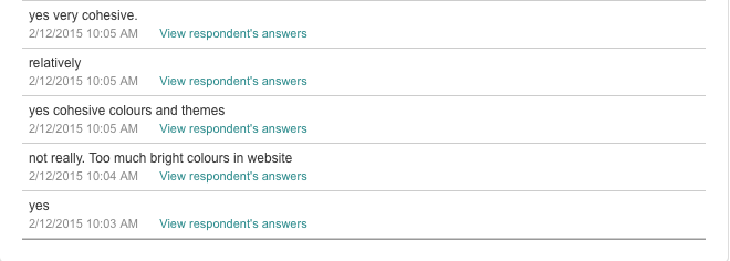


From this Feedback we knew what we did well and what didn't go that well, and in the time we had we were able to tweet a few things in the editing process. And we also attempted to theme parts of the artists star image around their criticism.
Also as the website was in construction at this point I was easily able to change the background since they didn't feel that they fitted with the video to create a cohesive package.
Tuesday, 3 March 2015
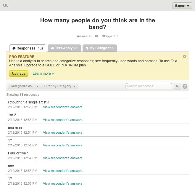
Music Video Feedback - Survey
Sunday, 1 March 2015
Digipak
 |
| Front Cover |
 |
| Album Tracklist |
 |
| CD |
 |
| Credits |
-----------------------------------------------------------------------------------------------
The symbols of the clouds and the plane wing connotes that the band are travelling, this connects to the album title 'Trouble in Paradise'. The images of the clouds and the plane symbolises paradise and freedom, however since there is a black and white overlay the image, it denotes that something bad might happen, this is a use of foreshadowing.
It also relates to the artist being a 'Hapless Romantic' or unlucky in love and really illustrates the emotional side of the artist, which the audience will buy into.
The use of colour for the bands logo means that it stands out from the rest of the image, it also relates to the music video since it is a single paint smear, and in the music video our lead singer is a 'Painter', ultimately building a cohesive package throughout my product.
The use of Red/Pink invokes passion and romance also relating to the lyrics of the song and the artist's name 'Hapless Romantic.' This will attract the female audience however isn't restricted just to teenage girls since the image used is mature and professional meaning that an older generation or a young teenage boy can easily listen to this as well.
I also created a Deluxe and Vinyl Edition of the album, the only main difference is the colour of the accent, in the Deluxe edition is Gold. and in the Vinyl Edition is Turquoise.


 |
| Original Photograph |
I made the shot black and white to focus on the form, texture, shape and composition of the image. There is a subtle change in tone and colour, which portrays a whole different colour in reality, and that what makes monochrome images effective.
I then made the image square so that it can be easily made to fit the digipak cover, I did this using the crop tool on Photoshop and using the ratio 1:1 so that it creates a perfect square.
Also on this image it includes the branding of an airline company, using photoshop I edited this out so that the viewer is unaware of the brand.
----------------------------------------------------------------------------
For the Album Tracklist I used a shot of a crumpled up piece of paper as the background for the image, this relates to the music video in which the lead singer crumples up images of the girls he doesn't like.
Also on the tracklist page is the record labels logo, and documentation including copyright and licensing.
Alongside there is also a barcode, all albums must have a barcode to be sold in shops, also the use of a barcode allows for a record label to easily find the number of albums sold by that artist.
----------------------------------------------------------------------------
The CD insert page is an image of a mountain range, again this relates to the emotional side of the artist, and relates to the album cover of the clouds as both are from a high angle.
----------------------------------------------------------------------------
The Credits page is a silhouette of the artist, this was achieved by going around an image of a side profile in photoshop and filling it in with a block colour.
Many other artists have used this technique to conceal the band members identity, some examples include Naughty Boy single covers, and the Dead Leaves album cover:


Sunday, 15 February 2015
Images for Digipak
I took an independent photoshoot without any other member of my group, since we all had to create an individual digipak ourselves.
I took these photos from my personal camera at different periods of time throughout the year, with the soul intention of using it for my artists digipak.
Therefore these images are of higher quality than would have been produced if we would have created a photo shoot, which would have seem fake or set up, this would fit more with my artist since I wanted to produce a synthetic artist with organic elements, such as making and producing their own music and not wanting their appearance to be the only selling point.
The images I created do not include the artists presence, nonetheless there are many other artists in the same genre who do not appear on the front cover of their album.
For example Coldplay, Kaiser Chiefs, Arctic Monkeys, Maroon 5, Alt-J, Royal Blood and Bastille.
Mainly these artist are bands with the lead singer being the only presence throughout the music video, this is displayed in our music video project as well.
However I will use images of my artist in the inside the digipak
Friday, 6 February 2015
Audience Feedback - Focus Group
We had a group of peers come watch our video to give some critical feedback. We gave them a survey with a series of questions.
Example of Responses from our focus group:


Music Video - For Critique
If you are unable to watch the above video please go to the following link:
Tuesday, 3 February 2015
Naming my Artist
I researched similar artists in the same genre as ours to see what their band name is like and how it was created. Artists including Maroon 5, Coldplay, Clean Bandit and Arctic Monkeys.
Most of the artist similar to ours have a name that is formed of two simple words, as such I will create a unique name made from two words.
Maroon 5, uses a colour in part of their name, as such I plan to use the name of a shade of colour as part of the artists name such as Navy, Indigo, Cyan, Teal
Also these bands have contradictory words, which adds a sense of intrigue for the audience. Therefore if the colour is a shade of blue, then the connotations that are made from using this colour should be contradicted with the other word used.
Those who write slow and downtempo songs usually use cold connotations in their name to reflect their work, to symbolise their depressed sombre lyrics. However those artists who write upbeat and cheerful songs have warm and colourful connotations in their name.
Therefore our artist is more likely to have warm coloured connotations since the song we are using is positive and cheery.
I also found that the artists name doesn't reflect the bands personality and style, such as Clean Bandit, which sounds like a gangster/R&B style group who are actually a band that only use orchestral instruments in their music. Therefore I can be really creative with the names, and any connotations from the words used will not be used to prejudge our artist.
 Some example I created include:
This also relates to our song since our narrative in the music video is our artist being unlucky in love and the band name 'Hapless Romantic'
Like other artists in the same Pop Genre including Taylor Swift, Ed Sheeran, Sam Smith and John Mayer all seem to tell stories about past relationships through the medium of song.
The name 'Hapless Romantic' is also associated to the target audience since the artist we are creating needs to be relatable to the audience. Since the target audience is Teenage girls, they will be probably going through the same situations as our artist.

Most of the artist similar to ours have a name that is formed of two simple words, as such I will create a unique name made from two words.
Maroon 5, uses a colour in part of their name, as such I plan to use the name of a shade of colour as part of the artists name such as Navy, Indigo, Cyan, Teal
Also these bands have contradictory words, which adds a sense of intrigue for the audience. Therefore if the colour is a shade of blue, then the connotations that are made from using this colour should be contradicted with the other word used.
Those who write slow and downtempo songs usually use cold connotations in their name to reflect their work, to symbolise their depressed sombre lyrics. However those artists who write upbeat and cheerful songs have warm and colourful connotations in their name.
Therefore our artist is more likely to have warm coloured connotations since the song we are using is positive and cheery.
I also found that the artists name doesn't reflect the bands personality and style, such as Clean Bandit, which sounds like a gangster/R&B style group who are actually a band that only use orchestral instruments in their music. Therefore I can be really creative with the names, and any connotations from the words used will not be used to prejudge our artist.
 Some example I created include:
- Indigo Sun
- Navy South
- Bitter Summer
- Dirty Saint
- Tropical Winter
- Humid Nights
- Organised Chaos
- Indian Summer
- Trouble in Paradise
- Hapless Romantic
This also relates to our song since our narrative in the music video is our artist being unlucky in love and the band name 'Hapless Romantic'
Like other artists in the same Pop Genre including Taylor Swift, Ed Sheeran, Sam Smith and John Mayer all seem to tell stories about past relationships through the medium of song.
The name 'Hapless Romantic' is also associated to the target audience since the artist we are creating needs to be relatable to the audience. Since the target audience is Teenage girls, they will be probably going through the same situations as our artist.

Thursday, 22 January 2015
Example Websites

One Direction are a synthetic boy band, their main audience members are teen girls which is highlighted in the layout and overall imagery of the website.
 The first landing page is of the band in a face on shot with the One Direction Logo pasted atop, then the name of their most recent album is underneath 'Four' and then a hyperlink for the user to purchase this album.
If left on this image for a long time, the shots of the images change fairly quickly in a series of collages, displaying to the fans their childish and cheeky personalities and also adds a sense of depth to the website overall feel.
Further down the page the user if left with hyperlinks to different sections of their website, including: Music, Band, Tour, Journal, Shop and Merchandise.
If hovered over, the hyperlinks change through a series of fonts, which makes the website feel more interactive.
 Down the page the user is overwhelmed with a large picture of the bands new music video, with a short description on one side of the page and a rather large play button on the other.
Then embedded into the page is a feed to the bands Instagram account, and a highlight from the 'Journal' section of the website, where the user is advertised to "Read More" of the article
Then a music section advertising the bands most recent album, then the bands next tour dates are displayed with a 'Buy Tickets' button.
 The user is also encouraged to subscribe to the bands newsletters, to find out major news in the lives of the most successful boy band in recent times.
Another hyperlink to the bands gallery is joined with a link to the bands twitter feed, which has also been embedded into the page.
Lastly at the bottom of the page the user is finally able to listen to the bands music through various different platforms, there are also numerous links to the bands social media pages including: Facebook, Twitter, Pinterest, Soundcloud, Spotify, YouTube, Instagram and Google plus
And also right at the bottom of the landing page is the artists record label, privacy policy and the ability to toggle the language which is seen on the page.
 |
| Social Media links and footer at the bottom of the page including Record Label, Language Toggle and Privacy Policy |
------------------------------------------------------------------------------------------

To contrast with the very synthetic boy band artist that is One Direction, I chose to look at the artist, Alt-J website, hoping to find the similarities and differences between these two different artists websites.
 They are an indie band, however they relate to our artist since the artist is not featured in their music videos or on their album covers, and rather opt for a faceless and abstract approach.
The imagery of the artist used on both their album and throughout their website could be seen as childlike and abstract since the image is of coloured paint. This adds a sense of innocence to the bands personality.
The website homepage is very clean and relates to the artists album with imagery of the paint splattered.
The links on the first page include News, Live, Music, Shop, Sign Up. Once hovered over they have a different colour.
Underneath the links to the website they have links to social media and online media pages, including Facebook, Twitter, YouTube, SoundCloud, Tumblr and Spotify.
 The News, Live and Music links automatically moves down the page where the contents is located, however the user can scroll down the page themselves without having to click a link.
However the Shop and Sign Up links take the user to a different webpage opened up in a new tab.
Other artists in their News section would include an embedded feed from their social media, however this artist feels though this is unimportant and feels like this is not actually news.
The next section is their Live concerts they are playing, it appears in a list with the most current show first, and also includes a link to where you can purchase tickets.
 |
| The SmartUrl website which allows the user to find different ways to listen to the artists music |
On certain songs which have been previously released as singles, once clicked, the user would be directed to a SmartUrl page where the user is given options to listen or watch the song or music video through various services such as YouTube, Vevo, Spotify, Rdio, Beats Music, Deezer, Google Play, Xbox Music etc.
At the bottom of the page it has the artists copyright, links to the artists record label, the websites privacy policy and terms & conditions.
And lastly there is a link to the website creator
Similarities
|
Differences
|
Highlights of content on one main page
|
1D – Links to different sections of the website for a more
detailed look
Alt-J – Directs you to items on this one main page
|
Interactive links to main pages including:
·
Music
·
Tour/Live
·
Shop
·
News/Journal
|
However these are in different orders for each artist.
1D – Also have link to merchandise
|
Interactive links to Social media pages including:
·
Facebook
·
Twitter
·
SoundCloud
·
Spotify
Sign up to the artists’ newsletter for fans to receive
major news happening to their artist.
|
1D – Pinterest, YouTube, Instagram, Google plus - These links are placed at the bottom of the page since their music isn't placed at the forefront of their careers success.
Alt-J – Tumblr
Instagram is a place
where images are used to tell a story, and since 1D are sold on their looks,
this is a perfect way for them to reach their fans, which may not be quite
right for Alt-J.
|
Takes full use of the whole screen, adding to the viewers
experience
|
1D - Large pictures of the band members
|
Buttons to purchase tickets for their upcoming events
|
1D - Twitter & Instagram feed embedded as part of their news
|
Able to play music video, stream and listen to music at a
click of a button
|
1D – They are the face of their brand, not the music they
create
Alt-J – are faceless and use colour and imagery used on
albums as a means of connecting to their fans
|
At bottom of page:
Record Label, Privacy Policy |
1D – Able to Toggle language
|
Subscribe to:
Comments (Atom)