Thursday, 18 December 2014
Audience Questionnaire - Survey Monkey
Wednesday, 17 December 2014
Account of Editing
 To get all our content onto our work space we had to connect the video camera to the computer to upload it onto the server for us to edit.
Once that was done we used the editing software, Adobe Premiere Pro. This software is easy to use and the functions that it can achieve are simple yet effective.
To start I cut down the video into shot type and labelled each one depending on the shot type, this was done so that we could easily move the shots around the work space, and be able to identify them easily.
Next we cut down the specific shots that we didn't like, so that all the shots that do end up in the final edit look presentable, this meant that we didn't need to waste time cutting shots up later on
Next I placed the footage in narrative order, since on the shot day we filmed shots out of order so that our actors could come at different times of the day, by placing it in order it meant that it was much easier to work with and less time consuming.
Next we put the shots together along with the accompanying music, and 'cut to the beat' of the music where we deemed appropriate, the outcome of this meant that the visuals seen on-screen look as though they fit well with the music. This is critical in trying to sell the artist, which is what we are trying to achieve.
Once I placed all the shots together, I found that some shots lasted too long or didn't fit well, this meant that I had blank shots in place so that I could place other shots in at a later date, this meant that I could easily visualise any extra shots we needed to produce in a second shot day.
After the second shoot day, I was able to place all the remaining shots in the sequence.
Then once all shots were put in place, I watched the video the whole way through, and analysed each shot and judged whether it was too long or too short, this is where I either sped up or slowed down the speed of the footage, this meant that the final product was timed correctly and looks professional.
Shots I edited in particular include:
The shot of the model walking in to the room for the first time. I reduced the speed of this footage, this meant that it relates to other typical movies in which the editing is in slow motion when the boy and girls eyes meet.
The shot, near the end, of the artist getting annoyed that the model has a boyfriend had to be flipped this is because we didn't shoot from another angle, and I thought that just having this shot playing for too long meant that it got rather boring.
Monday, 15 December 2014
Account of Shooting Day
The Day Before the Shoot our group:
This included the Tripod, Camera Stand, Camera Batteries and the Video Tape, We also had to get the camera at the right balance on the stand so that the shot ins't tilted, we also had to white balance the camera, this was done to make the final cut look as professional as possible.
We also set up the lighting so that it looks realistic and life like.
The first set we filmed at was an art studio, it was based in a garage and therefore we had to remove cars from the facility. The walls were adorned with old paintings, we placed 'dirty rags' over places where it didn't suit the concept, we then placed the Easel with the painting and a stall, in the middle of the room, so that the room looked effective.
Personally I thought the rooms ambiance was effective as it looked like a typical dingy and dark art studio.
Most of the shots had low lighting, this links to our Star Image since many artists in the same genre don't go by the typical bubblegum pop of Pink and bright colours, since they try to keep their masculinity which attracts the female audience further. It also means that the video can reach to an ever larger audience including males.
We divided the roles in half
Also because we had extra time it meant we could spend longer on each individual shot if needed, and had extra time to film extra shots, that make the video far more professional than it would without them.
The problems we had on the day of shooting, included:
The parts of the shoot that I thought could have been done better was the lip syncing section. We could have filmed more of this and used it throughout the video rather than in just one section, however we have planned on shooting again another day, where we have planned to film more of our lead actor lip syncing from all different angles and in different locations. The is because, the final video would have more of a cinematic feel if there is lip-syncing throughout, as lots of other music videos that have been created for other similar artists in the same genre, have some sort of lip syncing in them.
We managed our actors fairly well, since we were able to get them on set on time. The actors were able to voice their opinion on the different types of shots, however we had the bulk of control of what was actually going to be filmed.
The part of the shoot that I enjoyed the most was choosing extra shots that we could film, this was one of the creative parts of the shoot day as we could experiment with different ideas, and almost everyone had some input in choosing some of the extra shots.
On the day of shooting we tried to use a vary of shots, including: Birds Eye View / High Angle, Extreme Close Up, Close Up, Medium Close Up, Medium Shot, Medium Long Shot, Long Shot and Extreme Long Shot.
We then did shots in multiple angles to create depth, and so that it looks more professional.
We had another shot where we tracked the actress, and the camera moved with her, this was only used for the model that the artist chose, since we wanted it to look different from the other girls that came to audition, we used this technique so that the audience is able to easily identify the difference from the other girls
The onscreen chemistry between our actors, is the one thing I want to see the most out of our footage we filmed. This is because many people seem to judge the effectiveness of media by their actors, and so the relationship that we portrayed on screen must look real.
Our production group worked very effectively as a team, since we were able to get most of the filming done in a reasonable time, without too much going wrong. While the only things that didn't go right was because they were out of our control, i.e. the weather, meaning that we were unable to film certain scenes outside, since our actors and the camera equipment would have got extremely wet.
The lesson that we learned from this shooting day was to try to keep to our original Story Board and our timing we made beforehand, this would mean that time management and all shots would be filmed.
Also shoot as many shots as possible from all different angles, we lacked a vary of shots in some instances meaning that it looks quite dull, however filming again would mean that we can rectify this mistake.

- Transported the camera equipment from the school grounds using one of our team members cars.
- The day before filming took place on the Sunday, Kim started setting up the Art Studio for us to film in
- She gathered props together including: Painting Paraphernalia - Easel, Oil Paints, Paint Brush, Paint Palette, Old Paintings; Table, Chairs etc.
- Before filming each shot the actors rehearsed the scene a couple of times over, to familiarise themselves with the scene, and to make the scene look as believable as possible.
This included the Tripod, Camera Stand, Camera Batteries and the Video Tape, We also had to get the camera at the right balance on the stand so that the shot ins't tilted, we also had to white balance the camera, this was done to make the final cut look as professional as possible.
We also set up the lighting so that it looks realistic and life like.
The first set we filmed at was an art studio, it was based in a garage and therefore we had to remove cars from the facility. The walls were adorned with old paintings, we placed 'dirty rags' over places where it didn't suit the concept, we then placed the Easel with the painting and a stall, in the middle of the room, so that the room looked effective.
Personally I thought the rooms ambiance was effective as it looked like a typical dingy and dark art studio.
Most of the shots had low lighting, this links to our Star Image since many artists in the same genre don't go by the typical bubblegum pop of Pink and bright colours, since they try to keep their masculinity which attracts the female audience further. It also means that the video can reach to an ever larger audience including males.
We divided the roles in half
- Myself and Kim were directors. We decided on the shot type; including the angles, where the cameras were placed and instructed the actors. We were also the ones behind the camera; viewing what the final video would look like once in the edit, we also made decisions on extra shots.
- The extra shots we chose were: Close up of Paint pot, close up of Paint squirting out of the paint tubes, Close up of first painting on Canvas, I also decided to have a shot where the artist throws the pictures of the other girls directly towards the camera and for it to actually hit the camera lenses, this was done by bending down where the camera was very low with a high angle. This was my idea and I personally think it is effective, and seems professional since there is a vary of shots.
- Ben and Jake acted as producers, their role was to take care of the actors and make sure that the directors kept to the shooting schedule, we created before the shoot day which explained the timings of the shot day and where we had to be with each actor. And also explained which shots we had to film from the Storyboard we created.
Also because we had extra time it meant we could spend longer on each individual shot if needed, and had extra time to film extra shots, that make the video far more professional than it would without them.
The problems we had on the day of shooting, included:
- One of our actors not being able to show up on the day of shooting, and therefore we had to find a last minute understudy to take her role, this turned out to be a far superior choice since our stand- in had done Drama for A Level, plus the actress also knew our other actor beforehand and so the relationship worked better on-screen.
- Another problem was with the scenes we filmed outdoors. Since it was raining, the shots from outside were rushed and looked bad quality. Also because it was extremely difficult to set up the equipment again outside in the pouring rain, we only used it free hand, and so the camera looks fairly shaky.
- Another problem was that one of our team members not turning up on the day of shooting, this meant that we lacked leadership and we just wanted an extra person for their input.
The parts of the shoot that I thought could have been done better was the lip syncing section. We could have filmed more of this and used it throughout the video rather than in just one section, however we have planned on shooting again another day, where we have planned to film more of our lead actor lip syncing from all different angles and in different locations. The is because, the final video would have more of a cinematic feel if there is lip-syncing throughout, as lots of other music videos that have been created for other similar artists in the same genre, have some sort of lip syncing in them.
We managed our actors fairly well, since we were able to get them on set on time. The actors were able to voice their opinion on the different types of shots, however we had the bulk of control of what was actually going to be filmed.
The part of the shoot that I enjoyed the most was choosing extra shots that we could film, this was one of the creative parts of the shoot day as we could experiment with different ideas, and almost everyone had some input in choosing some of the extra shots.
On the day of shooting we tried to use a vary of shots, including: Birds Eye View / High Angle, Extreme Close Up, Close Up, Medium Close Up, Medium Shot, Medium Long Shot, Long Shot and Extreme Long Shot.
We then did shots in multiple angles to create depth, and so that it looks more professional.
We had another shot where we tracked the actress, and the camera moved with her, this was only used for the model that the artist chose, since we wanted it to look different from the other girls that came to audition, we used this technique so that the audience is able to easily identify the difference from the other girls
The onscreen chemistry between our actors, is the one thing I want to see the most out of our footage we filmed. This is because many people seem to judge the effectiveness of media by their actors, and so the relationship that we portrayed on screen must look real.
Our production group worked very effectively as a team, since we were able to get most of the filming done in a reasonable time, without too much going wrong. While the only things that didn't go right was because they were out of our control, i.e. the weather, meaning that we were unable to film certain scenes outside, since our actors and the camera equipment would have got extremely wet.
The lesson that we learned from this shooting day was to try to keep to our original Story Board and our timing we made beforehand, this would mean that time management and all shots would be filmed.
Also shoot as many shots as possible from all different angles, we lacked a vary of shots in some instances meaning that it looks quite dull, however filming again would mean that we can rectify this mistake.

Saturday, 13 December 2014
Tuesday, 18 November 2014
The Male Gaze
In our plot, the artist is voyeristically lusting after the girl while painting. The camera is subverted as a male looking at a women, this is classed as the male gaze.
Historically speaking, the typical viewer of artwork was male. The term ‘male gaze’ has been a subject of much debate by art historians and has been use in Freudian and feminist contexts to describe the sexual objectification of women through various media outlets.
Most depictions of the female in paintings throughout history have been commissioned and painted by men for the pleasure of other men thus leading to the ‘male gaze’. Since women throughout most of history have been subjugated, kept illiterate and treated as property of their fathers and husbands, they have learned to be actually aware of that gaze.
An example of this is from the OCR January 2012 exam, where they had to analyse the TV Drama, Fingersmith. It focuses on the undesirable love of one woman for another. In one scene the female is painting the other woman and the camera is used in a subverted way, hovering slowly over certain parts of her body, which the character is looking at.
This is rarely seen with this occurring over a man's body, since they are not typically seen as objectified.
Many other music videos use male gaze to sell the artist to the audience. This is especially in female artists music videos including Beyonce, Lady Gaga, Rihanna, Ariana Grande and Nicki Minaj
However male artists are also objectified, this is seen less often but it predominately used in Artist, Jason Derulo, to sell him to his female audience.
Friday, 14 November 2014
Influences of Music Video
One of the main inspirations we got for our idea for the music video is from James Camreons blockbuster movie 'Titanic', when Jack paints Rose. This is the first instant where they meet eye to eye and when their love flourishes. This is what we want our video to be like and the same affection to be met. This scene is iconic because of one of the quotes in the scene "Jack, I want you to draw me like one of your French Girls"
An additional piece that is an influence of our Painting Scene is from the movie 'Girl with a Pearl Earring'. In this movie it surrounds the making of the famous painting. We wanted to follow the same guidelines of this painting scene to make it look as effective as possible. Also the viewer may identify the intertextual moments that we have placed into the video.
The reason we found inspiration in this video is because the target audience is similar. Both our music video and 'Titanic' are centred around love, and similarly, to different extents tragedy. We thought if we had a similar aspect in our video to 'Titanic' the audience will relate and notice as it is so well known and popular. Having such a well recognised film inter textually linked with our video means we will have all different types of audiences watching, not just our specific target audience, teenagers.
Another Influence for our music video is from the movie '500 days of Summer'. This movie is based around a character who has fallen in love with a girl. As the audience member we see how their relationship progresses over 500 days. This relates to our video as we wanted to see how a relationship would start and the progression of what happends after they meet.
An additional piece that is an influence of our Painting Scene is from the movie 'Girl with a Pearl Earring'. In this movie it surrounds the making of the famous painting. We wanted to follow the same guidelines of this painting scene to make it look as effective as possible. Also the viewer may identify the intertextual moments that we have placed into the video.
And lastly a music video that influenced our idea is Taylor Swift's 'Blank Space'. One scene contains Taylor painting her on-screen partner, we wanted to use elements from this video since the artist is young and would also appeal to our target audience, the artist is also in the same genre as our artist, and the video has only been released recently and has subsequently racked up over 90 million views in less than 3 weeks and so the viewer can easily see the similarities.
Thursday, 13 November 2014
Our Perfect Audience Member
Our perfect audience member would be between the ages of 15-22. We decided this after reasserting similar artists and finding out their target audience and matching them up. Such artists include One Direction, McFly, The Vamps etc
Mostly our artist would appeal to females, since other artists similar to ours are not sold on their musical abilities but actually their physical attributes. Which means that it is likely that more woman would want to listen/watch their music based on the artists look rather than their actual talent.
Our perfect audience member would be a person who is particularly popular, seen as cool and friendly. The reason for this is because our artist would be found in the mainstream pop charts which the so called 'popular kids' would be listening to.
Since our audience member is typically a teenage girl, this means that their parents can afford to spend on merchandise and other synergy created by the artist. Many similar artists including One Direction take full advantage of this, by selling items such as pencils, keyrings, life size cutouts, dolls and bed sheets with the bands face stamped on, to make even more money out of their fans.
However it is not restricted to this, since our artist would attract a very wide range of demographic. It is highly likely that another audience member could be the complete opposite of the above audience member, and actually be very quite and shy, this is where the actual music relates, since the song is about love and our music video is created about losing love, someone who is an introvert can easily relate to what happens on screen.
As our perfect audience members has high disposable money since their parents are paying, it means that our target audience is able to purchase particularly expensive tickets to see their favourite artist perform live in concert.

One example of a perfect audience member:
Gabs is an 18 year old girl who loves music, in particular boy bands. She is a great example of a someone from our main demographic, since she is a popular teenage girl (over 1 thousand friends on Facebook) who lives in London, indicating that she is able to gain money easily to purchase music, memorabilia and concert tickets.
 She loves going to her favourite artists concerts and trying to meet them, she is willing to pay extra to do so.
Gabs creates fan pages on Facebook and Twitter for male singers, such as Justin Bieber, and has many followers who also like Justin Bieber.
She enjoys solo artists such as Ed Sheeran, Justin Bieber, Olly Murs and Sam Smith. She would definitely come to see our artist in concert and would purchase his merchandise.
It is people like Gabs which our artist is aimed at, a teenage girl who likes an attractive, appealing and relatable artist. This is what made us decide to have our artist appear in the music video, so his fans find it more personal since he is in the video.
This links to his star image of an average guy who appeals to not only teenage girls, but also male teens who can relate to him.
Mostly our artist would appeal to females, since other artists similar to ours are not sold on their musical abilities but actually their physical attributes. Which means that it is likely that more woman would want to listen/watch their music based on the artists look rather than their actual talent.
Our perfect audience member would be a person who is particularly popular, seen as cool and friendly. The reason for this is because our artist would be found in the mainstream pop charts which the so called 'popular kids' would be listening to.
Since our audience member is typically a teenage girl, this means that their parents can afford to spend on merchandise and other synergy created by the artist. Many similar artists including One Direction take full advantage of this, by selling items such as pencils, keyrings, life size cutouts, dolls and bed sheets with the bands face stamped on, to make even more money out of their fans.
However it is not restricted to this, since our artist would attract a very wide range of demographic. It is highly likely that another audience member could be the complete opposite of the above audience member, and actually be very quite and shy, this is where the actual music relates, since the song is about love and our music video is created about losing love, someone who is an introvert can easily relate to what happens on screen.
As our perfect audience members has high disposable money since their parents are paying, it means that our target audience is able to purchase particularly expensive tickets to see their favourite artist perform live in concert.
One example of a perfect audience member:
Gabs is an 18 year old girl who loves music, in particular boy bands. She is a great example of a someone from our main demographic, since she is a popular teenage girl (over 1 thousand friends on Facebook) who lives in London, indicating that she is able to gain money easily to purchase music, memorabilia and concert tickets.
She loves going to her favourite artists concerts and trying to meet them, she is willing to pay extra to do so. Gabs creates fan pages on Facebook and Twitter for male singers, such as Justin Bieber, and has many followers who also like Justin Bieber.
She enjoys solo artists such as Ed Sheeran, Justin Bieber, Olly Murs and Sam Smith. She would definitely come to see our artist in concert and would purchase his merchandise.
It is people like Gabs which our artist is aimed at, a teenage girl who likes an attractive, appealing and relatable artist. This is what made us decide to have our artist appear in the music video, so his fans find it more personal since he is in the video.
This links to his star image of an average guy who appeals to not only teenage girls, but also male teens who can relate to him.
Tuesday, 11 November 2014
Analysing the Animatic
To make our animatic I had to take individual shots of each frame that we made for our Storyboard.
I then had to send the images to myself using my email so that I could get them from my mobile phone to the computer, where we were assembling the animatic.
However the tricky part that arose was that the process of downloading the images from my emails onto the computer drive altogether was extremely difficult. And so I had to download each image one at a time which was a very ominous process, which took longer than it should have.
Once the images were all downloaded onto the computers hard drive, I had to then import it into Adobe Premiere Pro, again this had to be done individually, which made the process of making the animatic even longer.
I had to then download the audio clip of McFly's 'Love is Easy' onto the hard drive, and then import it into Adobe Premier Pro.
Once all the material was imported I had the task of getting the timings right depending on the timings that we set when making the storyboard. However once we put in the images we realised that the timings we made in the storyboard don't exactly cut to the beat of the song, which most music videos try to achieve, and so we had to arrange the shots in a way that it did achieve this.
We also used some shots more than once, this use of repetition is typical of a synthetic music video.
The result of the animatic allows the viewer to visualise our idea for the music video, I personally think that it is particularly effective in doing so.
What We Learnt
From creating this animatic I learnt how hard and tedious it is to gather all the media onto your working space ready for you to use.
Also I have now learnt more about timings and cutting to the beat using Adobe Premiere Pro. I am now finding it much easier to navigate my way around this professional program.
From this we learnt that we needed a wider range of shoots and we needed lip-syncing sections that would go alongside narration, these are the things that we will have to work on now.
Thursday, 6 November 2014
Analysis of a CD cover
 The name of the artist is One Direction
This connotes that the artist a one body, and that they are part of a wider group. Also they are moving in only one direction which is presumably up meaning that there fan base is increasing, and their global connectivity is ever expanding.
The font/lettering is best described as being painted, but is also in capital letters, this is the typical logo of the band, which is iconic on their albums and merchandise. However the actual album title is fairly mundane.
This connotes that the band is particularly creative and have their own style. However as the title is plain it connotes the artist is still serious about making music.
The physical appearance of the star is masculine, part of a group and they have a sultry pose looking at the camera, the camera angle is Eye Level, which allows the audience to feel as though they know the artist, clothing is fairly casual, however each have their own style that each of them wear, such as Harry with his hat, Niall wearing his iconic denim gilet, Zayne in a typical black/dark looking outfit. This allows the audience to judge each individual, point them out and choose their favorite. Their facial expressions are different in either shot, one where they are almost serious, whilst the other shot shows their funny side.
This connotes that this artist is just like any other boy band sold to teenage girls based on their looks.
The dominant image within the front cover is the artist itself
This suggests that the artist is sold on their looks, which is an indication that the artist is synthetic.
The title of the album is ' Four'
This signifies that the band is releasing their fourth official studio album, Beyonce also named her album '4' which indicated her fourth studio album release. This again signifies that the band is growing, and shows that they have produced 3 albums before and so they have a long history of music ahead of them.
Dominant colours include brown, black and blue
These connotes that the artist is trying to be serious and give off a professional vibe, this is compared to their first album release which used bright colours to emphasise their youthfulness and fun they can have.
The record label is Columbia and Syco
This connotes that the artist is fairly synthetic since most Organic artists like to be signed to small indie record labels which Syco isn't since it has Joint deals with the music corporation, Columbia Records. This appeals to the audience because Simon Cowell own Syco Music, he is the creator of the talent show X Factor where the group, One Direction was formed and made famous. Also on this label, Simon has also signed other acts from the show X Factor, and Britain's Got Talent. this is so those who watched this talent show will want to hear what happened to the artist after the competition ended.
The artist fits into the genre of Pop Rock/Teen Pop
This is signified by the bands use of dark colours and clothing style they have in the album cover image. Also it appeals to the pop genre since the artists face is in the album image, and the use of collage technique of having 2 similar images put together, adds a sense of sophistication and finesse.
Attitudes and values associated with this genre include a slight rocky edge while also appealing to young girl target audience.
The target audience for this CD cover is predominantly Teenage girls
The cover is appealing to this audience because it contains each individual band members face, and shows that they are a group that seem to get along together.
-----------------------------------------------------------------------------------------
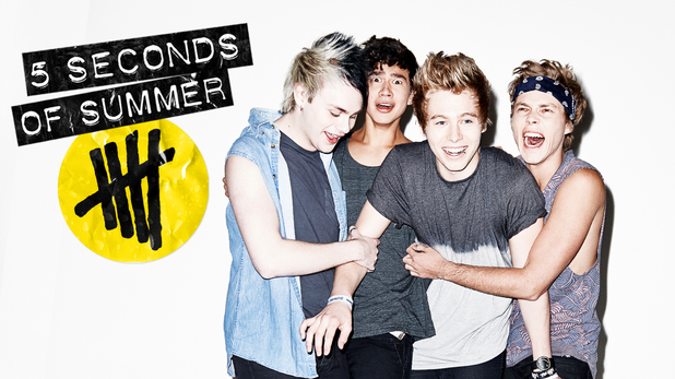
 The name of the artist is 5 Seconds of Summer
This connotes that the artist is fun, and energetic, and enjoys the perks of being a teenager.
The font/lettering is best described as grunge-y typewriter-esque
This connotes that the band wants to break away from the norms of society and the mundaneness of reality and just live life to the fullest.
The physical appearance of the star is a childish and reckless group of friends, their pose is almost like they are in a police line-up, their full body is shown so that the viewer, of teenage girls, can see the artist completely. the camera angle is Eye Level, which allows for the audience to feel as though they are with the band themselves, their facial expressions show their cheeky side and their character traits. All of this allows for the viewer to feel like they know the artists life.
This connotes that the band is not just sold on innocent sex appeal but also their cheeky nature.
The dominant image within the front cover is the band itself
This suggests that the artist is in fact synthetic since most synthetic artists are sold on their looks
The title of the album is '5 Seconds of Summer'
This signifies that the artist is debuting themselves, this is to entice the audience in and show them what they have to offer. The album is self titled to get their name out there, examples of other artists who have released an eponymous album include: ABBA, Aerosmith, Christina Aguilera, The Beatles, Beyonce, Blink-182, Jake Bugg, Bon Jovi, Blur, Foo Fighters, Jonas Brothers, Kasabian, Of Mice and Men, Elvis Presley, Paramore, Taylor Swift and Queen are but a few artist who have marketed their albums based on their artists name. It also doesn't just occur in the pop genre as shown from the examples but can be seen in Rock, R&B, Metal and even Country.
Some artists use it as a debut album title to sell themselves and put their name out, however there are other artist such as Beyonce who have self titled their album as they are fully aware of their popularity and fame and just use it as a marketing technique.
Dominant colours include Grey, Red and Black
These connotes that the artist is trying to portray their rock/punk side. While also focusing on their teenage audience with the colour red which has connotations of love and passion but also danger.
The record label is Capitol
This connotes that the band is a most probably a synthetic artist since many organic artists like to be signed by Indie Record Labels.
The artist fits into the genre of Pop Punk/Pop rock
This is signified by the use of dark colours and imagery of doodling in black ink marker, showing that the artist is fairly on the 'wild side' ,the use of the word 'dropout' above one of the band members head indicates that the artist doesn't care for mainstream education. They are also spray painted with an X showing that the band is fairly dangerous and rebellious.
Attitudes and values associated with this genre include wrecking things and just being a typical rebellious band that doesn't care about mainstream society.
The target audience for this CD cover is Teenage Girls
The cover is appealing to this audience because it displays each member of the band in full view, and shows their 'bad boy' image which may attract female audience members.

The name of the artist is Bastille
It is derived from the French Bastille Day, which is misleading since the audience may view the artist as being French when they are actually from London.
The font/lettering is all in bold which demonstrates the artist almost shouting/yelling at the viewer
The A in the bands logo is a triangle, this symbolises the bands quirky and unique nature.
Also in the cover we see the credits/rights of the songs on the album, this would normally be reserved for the back of the digipak, However in this case it enforces that the artist is more organic, since the music is at the heart of what sells the artist.
The stars physical appearance cannot be commented on in this image, since the viewer can only see a faint and blurry outline of the artist, running away from the camera, almost as though he is going to be run over by a moving car, which isn't seen, this can be related to the metaphor 'Deer in the Headlights', in which the artist may be running away of fear.
The dominant image within the front cover is the image of the lead singer of the band, but that image is fairly insignificant against the large logo, album title and credits which take up a lot of space on the front of the album.
The title of the album is 'Bad Blood'
This signifies that the artist star image is most likely to be off-the-wall, yet dangerous and risky.
Dominant colours include Black, Yellow and White
These connotes that the band is fairly dark, and unconventional to the normal stereotypes of bands who would be sold on their appearance.
The record label is Virgin Records
This connotes that the artist is most likely to be Synthetic, since Organic artists prefer to work with Indie Labels, and Virgin Records even though purely British, isn't an Indie Label since it operates as a division of Universal Music Group.
The artist fits into the genre of Indie Pop/Rock
This is signified by the use of dark colours, however it attracts the female audience because of the use of font.
The target audience for this CD cover are Teenagers of both genders
The cover is appealing to this audience because it contains the artist, however he isn't looking directly to camera, meaning that is acceptable for a male fan to own.
From an analysis of these CD covers I have gained an understanding of a range of ways I can target an audience with my CD cover, in particular I find the Bastille cover to be inspirational, as I have always considered it to be necessary to feature the band, now I am thinking that actually as long as the artists logo and name is on the album, it is equally as effective to just have an image. My target now is to explore images that are effective for a front cover.
This connotes that the band is a most probably a synthetic artist since many organic artists like to be signed by Indie Record Labels.
The artist fits into the genre of Pop Punk/Pop rock
This is signified by the use of dark colours and imagery of doodling in black ink marker, showing that the artist is fairly on the 'wild side' ,the use of the word 'dropout' above one of the band members head indicates that the artist doesn't care for mainstream education. They are also spray painted with an X showing that the band is fairly dangerous and rebellious.
Attitudes and values associated with this genre include wrecking things and just being a typical rebellious band that doesn't care about mainstream society.
The target audience for this CD cover is Teenage Girls
The cover is appealing to this audience because it displays each member of the band in full view, and shows their 'bad boy' image which may attract female audience members.
-----------------------------------------------------------------------------------
CHANGES
The name of the artist is Bastille
It is derived from the French Bastille Day, which is misleading since the audience may view the artist as being French when they are actually from London.
The font/lettering is all in bold which demonstrates the artist almost shouting/yelling at the viewer
The A in the bands logo is a triangle, this symbolises the bands quirky and unique nature.
Also in the cover we see the credits/rights of the songs on the album, this would normally be reserved for the back of the digipak, However in this case it enforces that the artist is more organic, since the music is at the heart of what sells the artist.
The stars physical appearance cannot be commented on in this image, since the viewer can only see a faint and blurry outline of the artist, running away from the camera, almost as though he is going to be run over by a moving car, which isn't seen, this can be related to the metaphor 'Deer in the Headlights', in which the artist may be running away of fear.
The dominant image within the front cover is the image of the lead singer of the band, but that image is fairly insignificant against the large logo, album title and credits which take up a lot of space on the front of the album.
The title of the album is 'Bad Blood'
This signifies that the artist star image is most likely to be off-the-wall, yet dangerous and risky.
Dominant colours include Black, Yellow and White
These connotes that the band is fairly dark, and unconventional to the normal stereotypes of bands who would be sold on their appearance.
The record label is Virgin Records
This connotes that the artist is most likely to be Synthetic, since Organic artists prefer to work with Indie Labels, and Virgin Records even though purely British, isn't an Indie Label since it operates as a division of Universal Music Group.
The artist fits into the genre of Indie Pop/Rock
This is signified by the use of dark colours, however it attracts the female audience because of the use of font.
The target audience for this CD cover are Teenagers of both genders
The cover is appealing to this audience because it contains the artist, however he isn't looking directly to camera, meaning that is acceptable for a male fan to own.
From an analysis of these CD covers I have gained an understanding of a range of ways I can target an audience with my CD cover, in particular I find the Bastille cover to be inspirational, as I have always considered it to be necessary to feature the band, now I am thinking that actually as long as the artists logo and name is on the album, it is equally as effective to just have an image. My target now is to explore images that are effective for a front cover.

Thursday, 30 October 2014
5 Seconds of Summer - Example Website
5 Seconds of summer is an Australian Pop Punk band
The band consists of lead vocalist, guitarist, bass guitarist, and drummer.
The group were originally YouTube celebrities, posting videos of themselves covering songs from various artists in 2011. From there, they gained a small following in 2012 after posting a series of cover versions of popular songs onto YouTube, then rose to international fame when One Direction invited them on their Take Me Home Tour.
The artist also has their own logo and another name they go by '5SOS' this is a much catchier name to go by, and their logo allows them to stand out amongst the other boy bands out there.
Merchandise
 Their official merchandise include:
The bulk of the merchandise fall below £15 however Hoodies, and Deluxe Bundles can cost as much as £35.
 As there are 4 members in the band it means that the fans have the option to purchase each individual band members own item, or they can purchase a pack which costs less than it would to purchase each one individually, this is a strategy to gain even more revenue from merchandise.
Other official merchandise by bands can go up to £50 for a duvet set. This means that 5SOS is directing their merchandise at the cheaper end of the market, otherwise consumers might be put off by the high prices.
The 5SOS store is owned and run by Universal Group. This means that the record label would presumably receive all of the profits made from selling these products. This is just another reason an indie record label would be unable to compete against the record label giants.
Social Media
 Their social media communication includes:
These allow the artist to communicate with their fans, they are also able to advertise themselves on a global scale, Which means even larger sales.
5 Seconds of Summer, have been reported saying that when they have time off from working, they stalk their own fans. Which means that they can find out what they like and create new media around their advice.
Fonts Colours & Images
The font they use as part of their star image is 'Plastique' it is a font that is based on a type writer and only uses capital letters. This allows for the band to stand out from the other boy bands out there.

 The background colours they use on their website and album is black and dark grey, and to highlight options they use White, Purple and Red, this may be used to attract viewers attention. Red and Purple is stereotypically a 'girly' colour, as to attract to the typical target audience.
The images on the website only consist of the band itself, which adds to the synthetic nature of the band. Some of the photos are personal amateur shots, which adds to the relatablility of the artist.
Target Audience
All of this attributes point to the target audience of teenage girls. From the merchandise, colours and social media they use are all targeted to a young audience.
Star Image
The star image of this band, is that they are trying to be a rock/punk band, but also appeal to girls, so they have to use grunge and funky colours so that it fits both criterias.
Organic VS Synthetic
The artist that would have a website like this would be a synthetic artist just because they have sections for Photos, also the social media they use means that they're the face of their music and the audience this website is directed to is pubescent girls.
From this I have gained a clear understanding that I now need to create a cohesive package and make sure that my music video and website link, if I am going to have an image on my CD cover that isn't of the band then i need to reflect the same on my website. Therefore my aim must be to find a striking image that would be un-threatening to pre-pubescent girls that equally sell him as a hapless romantic. At this stage I am veering towards using pastel colours, as I feel they are comforting, warm and non-threatening, everything I am trying to get towards in my artists star image.
The band consists of lead vocalist, guitarist, bass guitarist, and drummer.
The group were originally YouTube celebrities, posting videos of themselves covering songs from various artists in 2011. From there, they gained a small following in 2012 after posting a series of cover versions of popular songs onto YouTube, then rose to international fame when One Direction invited them on their Take Me Home Tour.
The artist also has their own logo and another name they go by '5SOS' this is a much catchier name to go by, and their logo allows them to stand out amongst the other boy bands out there.
Merchandise
Their official merchandise include:- T-shirts
- Hoodies
- Headbands
- Calenders
- Wirstbands
- Beanie hats
- Tote Bags
- Keyring
The bulk of the merchandise fall below £15 however Hoodies, and Deluxe Bundles can cost as much as £35.
As there are 4 members in the band it means that the fans have the option to purchase each individual band members own item, or they can purchase a pack which costs less than it would to purchase each one individually, this is a strategy to gain even more revenue from merchandise.Other official merchandise by bands can go up to £50 for a duvet set. This means that 5SOS is directing their merchandise at the cheaper end of the market, otherwise consumers might be put off by the high prices.
The 5SOS store is owned and run by Universal Group. This means that the record label would presumably receive all of the profits made from selling these products. This is just another reason an indie record label would be unable to compete against the record label giants.
Social Media
Their social media communication includes:- YouTube
- Instgram
- SoundCloud
- Tumblr
These allow the artist to communicate with their fans, they are also able to advertise themselves on a global scale, Which means even larger sales.
5 Seconds of Summer, have been reported saying that when they have time off from working, they stalk their own fans. Which means that they can find out what they like and create new media around their advice.
Fonts Colours & Images
The font they use as part of their star image is 'Plastique' it is a font that is based on a type writer and only uses capital letters. This allows for the band to stand out from the other boy bands out there.
The images on the website only consist of the band itself, which adds to the synthetic nature of the band. Some of the photos are personal amateur shots, which adds to the relatablility of the artist.
Target Audience
All of this attributes point to the target audience of teenage girls. From the merchandise, colours and social media they use are all targeted to a young audience.
Star Image
The star image of this band, is that they are trying to be a rock/punk band, but also appeal to girls, so they have to use grunge and funky colours so that it fits both criterias.
Organic VS Synthetic
The artist that would have a website like this would be a synthetic artist just because they have sections for Photos, also the social media they use means that they're the face of their music and the audience this website is directed to is pubescent girls.
From this I have gained a clear understanding that I now need to create a cohesive package and make sure that my music video and website link, if I am going to have an image on my CD cover that isn't of the band then i need to reflect the same on my website. Therefore my aim must be to find a striking image that would be un-threatening to pre-pubescent girls that equally sell him as a hapless romantic. At this stage I am veering towards using pastel colours, as I feel they are comforting, warm and non-threatening, everything I am trying to get towards in my artists star image.
Shooting Schedule
|
Time
|
Info
|
|
10:30
|
Setting Up equipment at House
|
|
11:00
|
Film Brandon getting ready & Print out
model advert (Shots 2-3, 24-26)
|
|
11:45
|
Leave Kim’s House
|
|
11:50
|
Arrive at café location & Set up
|
|
11:55
|
Film at café – Rachel & Brandon (Shots
5-7)
|
|
12:15
|
Leave café location
|
|
12:20
|
Arrive at Park location/Back Up
|
|
12:25
|
Film shots of girl in park (Shots
27,29,30)
|
|
12:50
|
Film Brandon painting – Blank canvas &
equipment (Shots 28,31 & Extra shots painting)
|
|
13:20
|
Leave Park/Back up
|
|
13:20
|
Arrive at Garage – Film location (Shots
1,4 & extra setting shots)
|
|
13:45
|
LUNCH BREAK
|
|
14:15
|
Start filming Rachel – Close Up &
Walking In (Shots 15-23)
|
|
14:40
|
Girls arrive
|
|
14:50
|
Start filming girls interview (Shots 8,9)
|
|
15:20
|
Film Brandon reaction to arrivals &
crunching up paper (Shots 10-14)
|
|
15:35
|
Walking down to House – Lipsycing (Shots
36-37)
|
|
15:55
|
Film at house – Upstairs & Window (Shots
38-40)
|
|
16:30
|
Film point of view – Cuddling (Shots
41-44)
|
|
16:40
|
Film texting – Artist & Girl (Shots
32-35)
|
Wednesday, 29 October 2014
Audience Questionnaire

From this we learnt that we needed to cast someone who had the right look for our teenage market. In addition we needed to make sure that our narrative merged seamlessly with our lip syncing because it was all going to be continuous and if it didn't work it wouldn't look proffessional. Therefore our targets are to make sure that our casting is perfect, that we work on how we want our main actor to sing and which shots he will sing, we rehearse with him and make sure we have the correct amount of shots to avoid it being dull because if it is dull it will not appeal to our target audience.
Actor Inspiration
The Artist - We wanted our main actor, to wear casual clothing and not dress up too much.
We based his style on Harry Styles and Ed Sheeran's casual clothing that they wear. Even though both artists have developed a sleeker look as they now have stylists, we wanted our actor to look mainly dressed down. These two are very influential artists in the music industry scene, and seeing as our target audience are adolescent girls, they would easily identify our inspiration and be able to relate to it.


The Boyfriend - We then wanted our 'Boyfriend' to have a suave and sophisticated 'Bad Boy' look, we searched for examples and came across the actor Ed Westwick, and old school style James Dean. James Dean is an icon for the 'bad boy' image, having inspired other people in the media industry including Justin Bieber and James Franco. We found this would be effective as they are influential characters, and fit in well with our target audience.
The Artist and the Boyfriend's actor inspiration both oppose each other. One is a very causal while the other is a particularly masculine look. This is a binary opposition and goes with the representation that Girl's go for the 'Bad Boy' rather than the one that is actually right for them.


The Model - We wanted our Female actress to be styled based on the 'Girl Next Door', examples of this styling include actress Zooey Deschanel and Kiera Knightly in the movie 'Begin Again'. Both of these actresses are very down to earth and not 'untouchable'. The target audience of juvenile girls would be able to relate to this as they are only young and discovering their own style.


Star Image
The star image related to this is a casual yet stylish band, that is 'down to earth' and easily relatable, this is shown by the actors inspiration by including other famous people who are known to be 'down to earth' and stylish.
Organic VS Synthetic
The artist is synthetic and is primarily sold on their looks and so the clothing must be stylish, yet not over the top and unattainable. To attract the right target audience of young teenage girls.
Genre
The genre of the band is particularly pop related and so the actors must be stylish and the clothes that they wear should be popular choices.
From looking at actors I have understood that my artist should be both appealing to the opposite sex, non threatening, as i want him appealing to young girls, but also have a nice smile. He needs to have a boy next door look, not overly good looking but equally appealing to them. My target now is to look for a suitable actor and audition them.
We based his style on Harry Styles and Ed Sheeran's casual clothing that they wear. Even though both artists have developed a sleeker look as they now have stylists, we wanted our actor to look mainly dressed down. These two are very influential artists in the music industry scene, and seeing as our target audience are adolescent girls, they would easily identify our inspiration and be able to relate to it.

The Boyfriend - We then wanted our 'Boyfriend' to have a suave and sophisticated 'Bad Boy' look, we searched for examples and came across the actor Ed Westwick, and old school style James Dean. James Dean is an icon for the 'bad boy' image, having inspired other people in the media industry including Justin Bieber and James Franco. We found this would be effective as they are influential characters, and fit in well with our target audience.
The Artist and the Boyfriend's actor inspiration both oppose each other. One is a very causal while the other is a particularly masculine look. This is a binary opposition and goes with the representation that Girl's go for the 'Bad Boy' rather than the one that is actually right for them.

The Model - We wanted our Female actress to be styled based on the 'Girl Next Door', examples of this styling include actress Zooey Deschanel and Kiera Knightly in the movie 'Begin Again'. Both of these actresses are very down to earth and not 'untouchable'. The target audience of juvenile girls would be able to relate to this as they are only young and discovering their own style.


Star Image
The star image related to this is a casual yet stylish band, that is 'down to earth' and easily relatable, this is shown by the actors inspiration by including other famous people who are known to be 'down to earth' and stylish.
Organic VS Synthetic
The artist is synthetic and is primarily sold on their looks and so the clothing must be stylish, yet not over the top and unattainable. To attract the right target audience of young teenage girls.
Genre
The genre of the band is particularly pop related and so the actors must be stylish and the clothes that they wear should be popular choices.
From looking at actors I have understood that my artist should be both appealing to the opposite sex, non threatening, as i want him appealing to young girls, but also have a nice smile. He needs to have a boy next door look, not overly good looking but equally appealing to them. My target now is to look for a suitable actor and audition them.
Artists Similar to Ours
We have chosen a particular artist that has a target audience of teenage girls. We chose this because they are very popular within the music industry at the moment, since the rise of X Factor and talent contest emulating the talent and looks of new bands, and we decided to take advantage of what is popular right now.
We want our artist to be similar to the most popular artists at the moment, like these ones below :


We want our artist to be similar to the most popular artists at the moment, like these ones below :


All these artists are based around their star image and are big in the pop genre. This is similar to our artist. The star image of these groups is based around their good looks and the attraction of teenage girls, which is what we want. All of the groups have the clean cut look, which is exactly what we were looking for.
These boy bands are based on their looks and sold on this ideology, meaning that these artists are completely synthetic.
These artists are represented as innocent sex appeal, which seems to sell alot with young girls.
----------------------------------------------------------------------------------------
CHANGES
I wanted my artist to be more organic and therefore not sold solely on their appearance rather than their musical talents. As a result The Star image of my artist has changed to a down to earth, relatable and attainable band.
Artists which are similar in the way they represent themselves to their audience include:


All these artists are bands, in their album cover they usually have abstract images or symbols, which do not show the artists physical appearance. Also in their music videos they normally have the lead singer only who is seen in their video. For example Adam Levine, Chris Martin, Alex Turner and Dan Smith appear in the bands music videos either Lip syncing or acting a role, while the other band members normally remain anonymous and are not involved in the video.
Subscribe to:
Comments (Atom)